Reimagining Content for Energy’s Future
Chevron: Improving Employee Experience Through Data-Driven Navigation Design
Client: Chevron
Sector: Enterprise / Energy
Services Delivered: UX Research, Content Strategy, Navigation Design
Project Type: Card Sorting, Tree Testing, Information Architecture
Challenge
Chevron Inside — the company’s internal site — is a critical platform for global employee communication and access to corporate tools, resources, and information. But years of ad hoc content expansion had created a cluttered structure that frustrated users and buried key information.
Chevron needed to redesign the site’s navigation to be more intuitive, accessible, and aligned with how employees actually think.
Approach
I led a comprehensive UX research engagement focused on content architecture clarity. The process included:
-
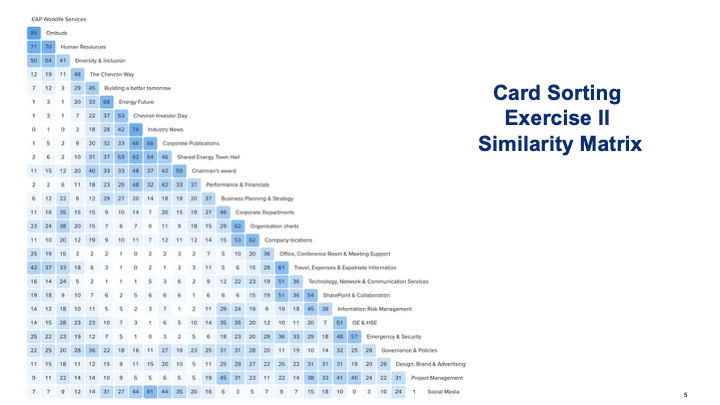
We invited internal stakeholders to participate in a moderated card sorting study to reveal how employees naturally grouped and labeled site content.
6 participants, dozens of internal topics
Analyzed common category groupings and language patterns
Synthesized findings into proposed information groupings and user-centered terminology
-
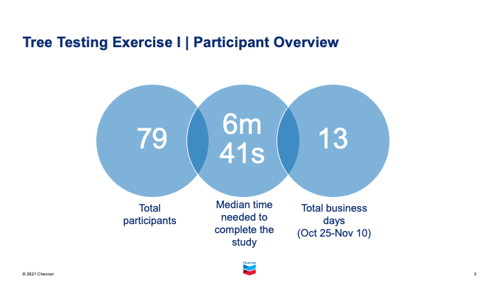
We then validated the proposed structure using real-world navigation tasks in a tree testing environment:
12 scenario-based tasks tied to common employee goals (e.g., onboarding, accessing policies, checking event info)
Measured success rate, directness, and first-click accuracy
Captured confidence levels and path corrections to fine-tune decision points
Chevron adopted the new IA structure, leading to a more intuitive and searchable user experience across the internal site
The initiative was recognized with an internal award for improved employee experience
The new model has since been used as a blueprint for additional UX improvements across other Chevron digital properties
Outcome
Services Provided
UX Research Planning
Moderated Card Sorting
Tree Testing & Task Design
Information Architecture Redesign
Navigation Strategy
Content Labeling & Categorization
Key Insights & Recommendations
Participants showed a clear preference for logical, simplified category names like “Our Company” and “Support & Services”
Tasks tied to high-interest areas (like return-to-office info and internal events) had the highest direct success rates (50–77%)
Tasks with poor performance revealed opportunities to relabel or relocate content (e.g., Investor Day resources hidden in ambiguous categories)
Final recommendation: Consolidated top-level nav with cleaner subcategories, simplified label structure, and improved alignment to real employee journeys